

Bird On Barn Door

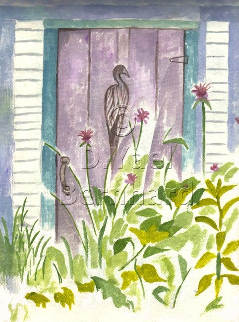
Some years ago, my older daughter lived in northern Vermont. She has a knack for finding picturesque places to live – “penniless in paradise,” I used to call her, for such charming places as this rural shire did not offer much in the way of employment. She moved with such ease from place to place, alighting in the most uncanny abodes. What’s money when you wake up to a bucolic landscape? Somehow she scraped by, alternating between child care, goat tending, berry picking, gardening, and if my memory serves, even working on a rabbit farm.
One antique farmhouse where my daughter lived for a while had a low white barn adjacent to it, with overgrown flower gardens all around. There I visited her, and walking among bee balm and hollyhocks, came upon this weathered purple door with a bird carved on it. Such rustic character! I love windows and doors as painting subjects, and this one fairly begged to be painted.
All I had with me was a small set of gouache paints and a sketchbook. It would have to do – in fact, I liked the restriction, as it freed me to keep it simple.
A quick sketch, whether drawn or painted, employs the background surface as part of the image. The paper or canvas shows through as a color, texture, or neutral ground. Here a great deal of white paper shows through, which would not likely happen in a more developed painting. The composition is also top-heavy, with dark, dense shapes at the top and light, airy ones at the bottom. In fact, the painting trails off on the bottom and isn’t even finished. This struck me as counterintuitive, as one would normally make the sky lighter and more spacious, and lower objects denser and darker. Every time I look at this painting, I notice this progression of upper density to lower spaciousness. Without the central focus of the bird, I’m not sure it would work at all.
Uneven progressions and patterns in painting have always intrigued me. Like a law of physics, there’s an underlying urge to even things out – to distribute colors and textures uniformly across the surface. Sometimes this works – but to forge uneven ground is to create polarity, which may take a work of art in a whole new direction. It’s a bit of a risk, which may lead to either ruin or revelation. An artist shouldn’t have too much control over their work. One must leave room for the unexpected.
I wish I had more time for these quick color sketches!
A good week to all –
D. Yael Bernhard
https://dyaelbernhard.com
Have you seen my other Substack, The Art of Health? In addition to being a visual artist, I’m also a certified integrative health & nutrition coach with a lifelong passion for natural food cooking and herbal medicine. Now in its second year, this illustrated newsletter explores cutting-edge concepts of nutrition. I strive to make relevant information clear and accessible, and to anchor essential health concepts in unique images. Check it out, and if you like it, please subscribe and help spread the word. Your support keeps my work going!