Image of the Week: Falling Raptors

© D. Yael Bernhard
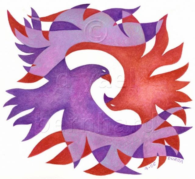
Falling Raptors was painted during a transitional period in my work as a fine artist. I was in the process of outgrowing the use of outlines – a technique I had depended on for many years. I had used colored outlines in a children's book that I illustrated titled Eagles: Lions of the Sky; now I wanted to do something different. There was something clean and sensual about shapes without outlines, and I was intrigued by the numerous examples I found in Indian art, American folk art, Native American art, and modern artists ranging from Magritte to Modigliani to Georgia O'Keeffe.
The opportunity to paint raptors this way came when I was walking near the Hudson River one day, and actually saw two large hawks doing their mid-air mating dance. I had read about this unique ritual in which a male and female raptor circle each other high in the sky, then join talons and tumble downward as one for a few seconds. I watched, literally enraptured – for both the words "raptor" and "rapture" are derived from the same etymological root – rapt, to seize or carry off. It was a magical moment, as the birds joined in a fleeting frenzy of cartwheeling motion, then let go and soared apart, drawing spirals in the air that crossed and recrossed each other.
This simple gouache painting was one of many to come that would use overlapping, transparent shapes – a technique that is incompatible with outlines. It was partly inspired by Milton Avery, the famous landscape painter who frequented some of my own favorite painting destinations – Cape Ann, Massachusetts; Woodstock, NY; and Vermont. Avery introduced me to overlapping transparent fields of color (though he employed them in an entirely different manner, and was not known for this). In this case, I used blending within those overlapping fields, even as the birds themselves are flat and graphic. Together, they form a sort of abstract flower. I drew the hawks separately on two pieces of tracing paper, then slid one over the other until they formed a balanced whole. The purple and red heads and beaks are opposite color schemes, and the overlapping areas are paler versions of both colors.
It's pretty rare that I feature red in a painting. I don't know what led me to use stylized color, but I'm glad I did, and kept it simple. My goal was to convey a sense of motion and energy as the two birds engage – and to capture a unique memory of a rarefied moment in nature. No background was necessary.
I still use overlapping, transparent shapes a lot, and I constantly make use of tracing paper. After almost twenty years of using Photoshop to edit and prepare images for publishing (including the embossed watermarks that help protect my copyright), I contend that no graphic program comes close to tracing paper as a tool for trial and error; and no digital technique can ever match the value of drawing by hand. These beliefs may be old-fashioned; so be it.
A good wintery week to all.
D Yael Bernhard
http://dyaelbernhard.com
children's books • fine art • illustration
posters • cards • calendars


