Image of the Week: Interrelationship

© D. Yael Bernhard
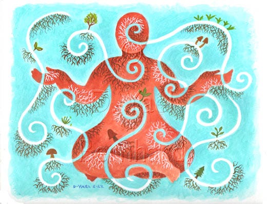
I created this illustration an article in my new nutrition newsletter, The Art of Health. Illustrating nutrition concepts isn't easy, as subjects such as new discoveries about saturated fat or the effects of fructose on human metabolism are not particularly visual. This kind of material lends itself well to editorial illustration – a style that once upon a time accompanied many op-ed articles in newspapers, back when illustrations were more frequently used.
Editorial illustration isn't my favorite style, but as an illustrator, my job is to serve the content being published, not my personal creative expression. Acting as my own editor was no exception. This particular article, titled, "The World Within You," is about our interrelationship with the millions of living microorganisms that populate our bodies, and how we are inextricably interconnected with nature. Published on May 18th, the article seems to have been well-received and well-read.

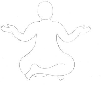
But the end product belies the struggle that went into the process, for the above illustration was the fourth version I've done over the past six months. It all began with this pencil sketch, in which a human silhouette sits in harmony with the outside world. Simple, right? As a sketch, yes, but execution is always another matter. I wanted the final color version to show the interrelationship of earth and sky. I wanted to show roots, and mycelium, and mushrooms and plants and microbes growing in, on, and around this person. I wanted an intricate and vivid exchange of energy.
But all these dichotomies wouldn't fit into one image.
With each new version, something was missing. I felt compelled to keep trying different approaches, not sure if it was dedication or stubbornness that kept me going. Nobody was paying me to do this piece.

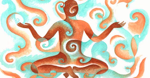
First I tried to articulate earth and sky inside and outside the figure. Then I tried drawing the roots with black ink, and used a fine paintbrush to articulate white mycelia. This was better, but still not right.

In my next version, I wanted the figure embedded in dark, earthy loam, showing both roots and mycelia. I accomplished that, but at the expense of the symbolic exchange between inner and outer, represented by the spirals, not being clear. The figure merely looks like it's sitting among dancing spirals.

I liked this painting, but didn't feel it served the article.
Finally in version 4, seen at the top of this post, I managed to express the essence of my idea. Stripped of details, this illustration conveys a sense of pure interaction. The earthy hues of the figure spiral into the sky, and vice versa. It's a two-way relationship. I also made this humble person more slender. There's also a lot of white in the background, which is actually bare paper showing through. This was the biggest departure from the other versions. Allowing the image to breathe was the ticket.
This sort of trial and error is typical of my work. I constantly face forks in the road when deciding how to translate sketches into finished paintings: should I use outlines or not? Light on dark, or dark on light? Gradients or solids? It's different for each work of art; the painting dictates, and I follow. Sometimes the only way to find the right path is to try going down all of them. It takes courage to turn back when you know you've gone the wrong way. I try to regard my outtakes not as a waste of time and effort (and paint, canvas or paper), but as part of the creative process. I don't always succeed in embracing that view. My higher self sees value in failure, but my grumpy lower self hates the idea of starting over again, and wants to get on to other paintings.
Would you like to see how this illustration was used? Read the article (or listen to my voiceover!) and you'll find out. Did I choose the right version? You decide.
A good week to all!
D Yael Bernhard


