


The People Could Fly

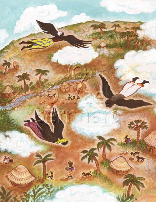
Here’s another illustration from a leveled reader – a type of educational booklet published for elementary school classrooms, designed to teach vocabulary and introduce children to other subjects – in this case, American history and the slave trade.
It’s a tricky subject to teach young children. How do you show cruelty and injustice to an 8-year-old? Lying by omission is a skill that children’s book editors put to good use. Whatever I was told to depict showed part of the truth – as much as young readers can handle. Yes, there were images of slaves on board ship, stacked on shelves below deck like cargo. But the style of illustration (as above) wasn’t realistic enough to show grit or sweat, and I cropped the picture so that only a little bit of the chains showed.
Further shielding children from the bloody truth of slavery was the fact that the story was a folktale told by slaves themselves. “The People Could Fly” was originally an oral tale that has been put to paper and published in many versions. Indeed, I admired one such version myself, illustrated by renowned husband-and-wife team Leo and Diane Dillon, back when I was just starting out as an illustrator. “The People Could Fly” is a fanciful tale of magical transcendence of tragic circumstances. This ascension by divine intervention was also an expression of Christian faith, which the Afro-American slaves clung to like a life raft.
I thought long and hard about what angle or perspective I should use for this picture. The editors left it up to me. Should the viewer be looking up at the flying slaves against the sky? Should I show one person up close and smaller figures in the distance? Ultimately I settled on this birdseye view, looking down. It was challenging depicting the trees from above, and trying to get some sense of space between the winged figures and the earth below them. My colors go from purple to brown to ochre – a perfect palette for an African village, which the slaves have returned to from across the ocean in their soaring freedom. I love how the dark brown figures relate to these colors. Here again is my habit of painting halos around shapes – a technique I’ve used in detailed gouache paintings such as “Genesis” from last week. It both softens colors and intensifies contrast.
I think I did an acceptable job on the clouds. Even after thousands of illustrations, clouds still aren’t easy. As the song goes, I really don’t know clouds . . . at all.
A good week to all –
D. Yael Bernhard
https://dyaelbernhard.com
Have you seen my other Substack, The Art of Health? In addition to being a visual artist, I’m also a certified integrative health & nutrition coach with a lifelong passion for natural food cooking and herbal medicine. Now in its second year, this illustrated newsletter explores cutting-edge concepts of nutrition. I strive to make relevant information clear and accessible, and to anchor essential health concepts in unique images. Check it out, and if you like it, please subscribe and help spread the word. Your support keeps my work going!